Two graphs that may show a shocking truth about our K-12 education system
I really included three but the first two are the most important and "three graphs" seemed a less-catchy headline.
Below are two graphs on US education that absolutely blew my mind.
Both are from Stanford University, where a team of researchers (some from other universities) compiled the Stanford Education Data Archive (SEDA), which aggregates state test score data from across the country. I came across them because I’m helping teach an undergrad course at Harvard on the US K-12 education system.
Here’s the first graph, which shouldn’t be very surprising. It compares students’ average test scores (the y-axis) to the level of poverty in their schools (the x-axis). Levels of poverty are measured by the percentage of students in a school who qualify for free or reduced-price lunch. Each bubble/dot represents a specific school in the US, and the size of the bubble/dot is related to the school’s enrollment.
As you can see, the trend line is pretty clear: students in schools with higher levels of poverty generally perform worse on state tests than students in schools with wealthier families.
Here’s the second graph. This one really shocked me. Instead of comparing overall test performance to levels of poverty, it compares students rates of learning (y-axis) to the level of poverty in their school (which is still measured by the percentage of students qualifying for free/reduced-price lunch) on the x-axis.
As you can see, there is no clear trend line. In other words, there’s no strong correlation between the rate at which students learn and the level of poverty in their school.
You can check and manipulate the graph for yourself here (poverty v. avg test scores) and here (poverty v. rates of learning).
You can even search for specific schools, districts, counties and states by clicking on the pin at the bottom left of the screen.
As always, I take any data set with a grain of salt, preferably a large grain of flakey Maldon sea salt.
This data is from the period of 2009 - 2018, and it likely reflects education policy enacted well before that period, since student performance is a lagging indicator of any changes made in how we teach them.
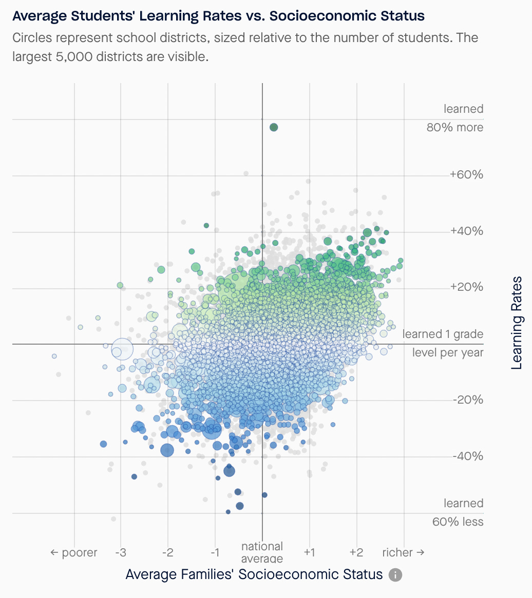
It’s also important to note that if we sort the learning rate data by districts instead of schools, a clearer trend line emerges.
Notice that, generally-speaking, students in districts with higher levels of poverty don’t learn as fast as students in wealthier districts.
I’m still trying to draw some conclusions from this, and I wanted to share it ASAP because 1) I haven’t published in forever and the writer’s block just needed to be broken and 2) I’m curious to hear your thoughts: what do you make of this? What am I missing?
Thanks for reading — have a great weekend!


Where does the data come from for rates of learning? Is it growth on the test scores?
Things very interesting! Love the maps. I pulled up my county and district. Thx